


Understanding delays at major USA airports
Introduction
This week, I will explore delays at major airports in the USA, and try to understand if there are groupings of airports that perform similarly based on a number of operational and delay metrics available from the Federal Aviation Administration (FAA). This could be a first step in trying to minimize delays at airports nationwide.
Objective
Use Principal Component Analysis, understand characteristics and groupings of major airports based on departure and operational airport data from 2004-2014.
Executive Summary
- 2 principal components explain 80% or more of the variance associated with on-time airport departures for the 3 years investigated - 2004, 2009 and 2014.
- There seem to be at least 3 clusters/groupings of airports that have the worst on-time departure rates. Counterintuitively, even some airports with extremely low flight volumes were prone to major delays. One possibility is that the airspace over these small airports may be crowded due to presence of larger airports nearby, and flights from these smaller airports getting lower ‘priority’.
Methodology
Here’s the rough order of steps I followed in arriving at answers to these questions:
- Data acquisition
- Data cleaning
- Exploration/visualization
- PCA
(1) Data acquisition
3 data sets were available as CSV files:
- (“cancellations.csv”) Number of departure and arrival cancellations and departures for each airport, by year
- (“operations.csv”) Operational data for each airport by year, like number of departures and arrivals, percent on-time gate departures, average taxi out delay, average airborne delay
- (“airports.csv”) Airport details, like airport code, address, FAA region, and geographic coordinates
The data was first imported into Python using Pandas to see what data was available in each file, and then exported into a Postgres SQL server running on my machine.
# Write all files to local PostgreSQL DB
from sqlalchemy import create_engine
engine = create_engine('postgresql+psycopg2://postgres:****@localhost/FAA')
dfc_raw.to_sql('cancellations', engine, if_exists = 'replace')
dfo_raw.to_sql('operations', engine, if_exists = 'replace')
dfa_raw.to_sql('airports', engine, if_exists = 'replace')
(2) Data cleaning
The cancellations data set contained data exclusively related to the target (delays), so it was not used for any analysis. The operations data set contained data related both to the target (like percent on-time departures and arrivals), as well as possible predictors (like number of departures, average taxi out delay, average airborne delay, etc.). The only piece of data that was missing, and could be useful (for visualization) was the latitude and longitude, which was obtained from the airports data set using a simple SQL query.
There were no null values in the resulting dataframe, so this was a relatively clean dataset.
# Get coordinates from airports table, and add to operations table
conn = psycopg2.connect("dbname = FAA host = localhost user = postgres password = ****")
query = '''SELECT o.*, a."Latitude", a."Longitude", a."STATE"
        FROM operations o
        LEFT JOIN airports a
        ON o."airport" = a."LocID"
        '''
# Get table into dataframe
df_raw = pd.read_sql(query, con = conn)
# Check for null values
for col in df_raw.columns:
    if df_raw[col].isnull().any() == True: print(col)
(3) Visualization
Here are a couple of observations:
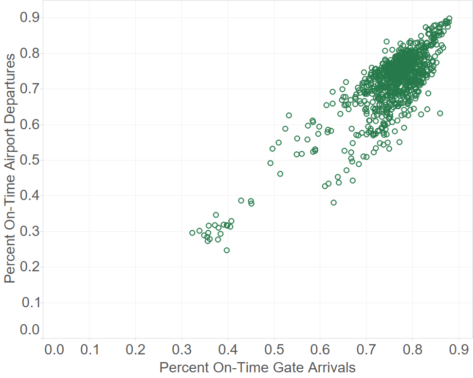
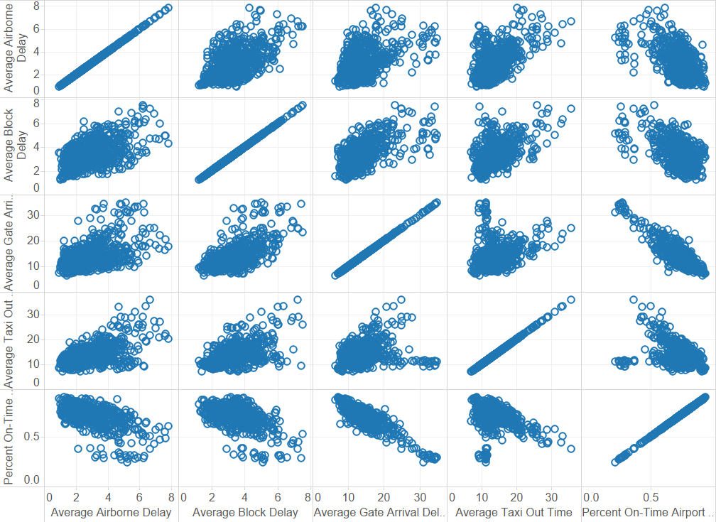
% on-time departures and arrivals (targets) are correlated, as expected. The number of departures and arrivals - which is one set of predictors - are also well-correlated. This means that we could choose just one of these predictors for the PCA (I could have left both in, and let PCA take care of it to get the same end result).
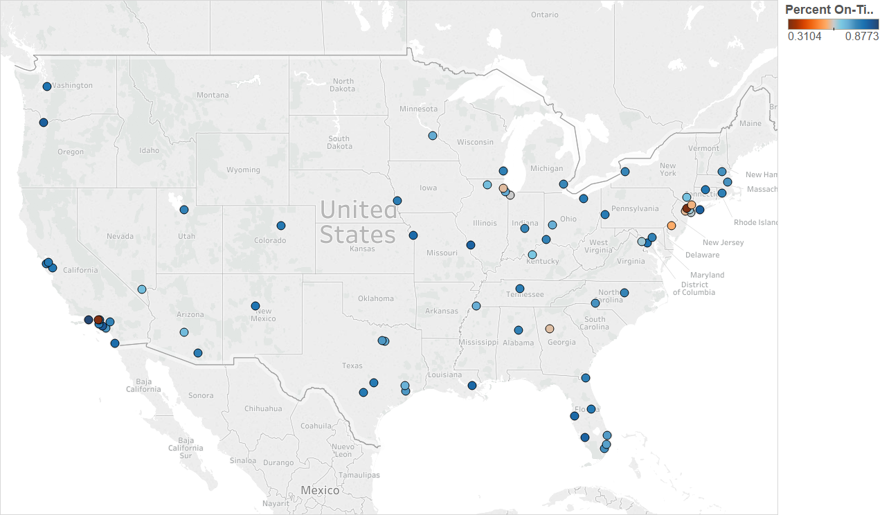
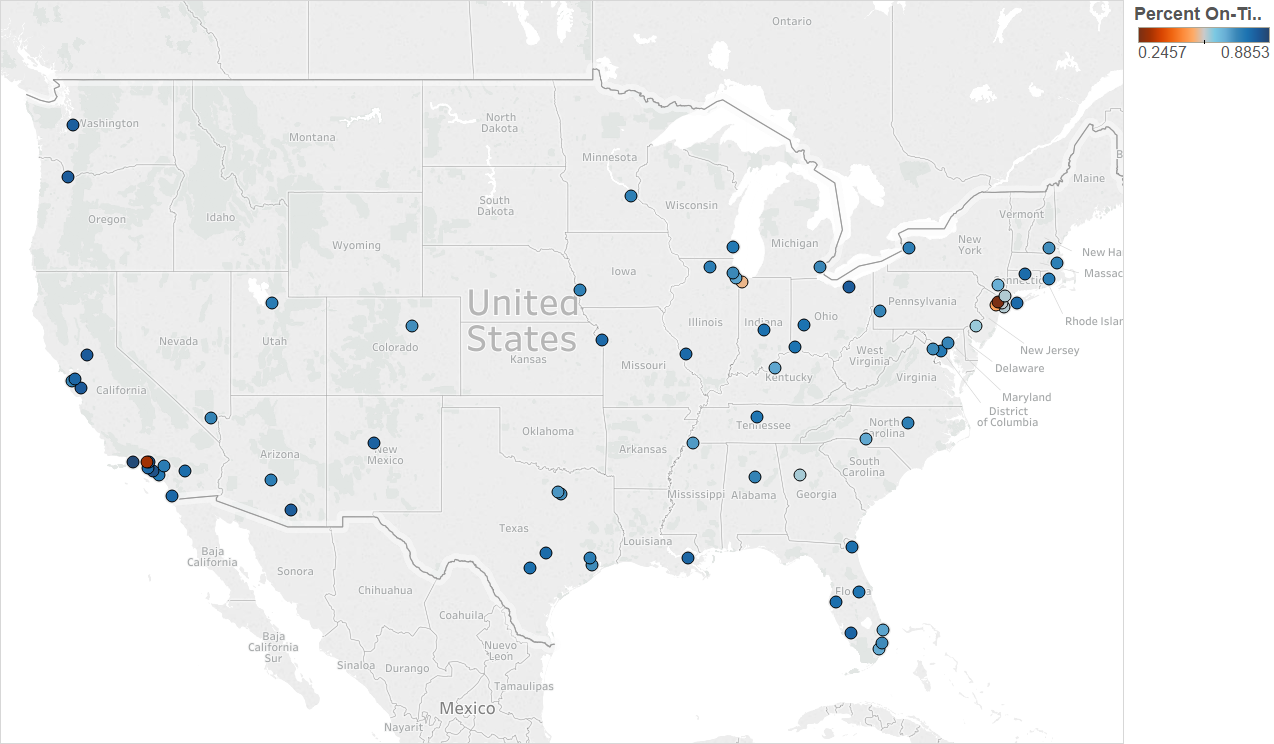
Generally, on-time departures seem to be dependent on number of departures, i.e. more departures = worse delays. But there may be 3-4 clusters of the worst on-time departure rates, depending on both volume of traffic and other factors. It is surprising that some small airports have the worst delays.

A lot of the predictors (operational components) of delay seems to be correlated to one another. PCA is likely going to useful for this problem.
The median on-time departure rate (across all airports) was fairly steady between 2004-2014

The worst airports (in terms of % on-time departures) in the continental USA seem to be in the some of the busiest airspaces in the continental USA (NY, LA, Chicago and Atlanta areas)
Year 2004
Year 2009
Year 2014
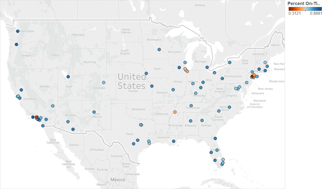
Along the larger airports, Newark (EWR) in particular had a mixed performance over the years, despite not much change in flight volume (Note: all times are in minutes)


(4) PCA
I used eight features from the operational data set to run the PCA (only number of arrivals was ignored, per the discussion in the previous section). These were:
- Number of departures
- Average_taxi_out_time
- Average taxi out delay
- Average airport departure delay
- Average airborne delay
- Average taxi in delay
- Average block delay
- Average gate arrival delay
The PCA was run for 3 different years - 2004, 2009 and 2014. All features were standardized prior to PCA.
def make_plot(var):
    n = range(1, len(var)+1)
    cum_var = np.cumsum(var)*100
    plt.xlabel("# Principal Components")
    plt.ylabel("% Explained variance")
    plt.plot(n, cum_var)
    plt.show()

def build_model(Xs):
    model = PCA()
    X_pca = model.fit_transform(Xs)
    var = model.explained_variance_ratio_
    make_plot(var)
    return(X_pca)
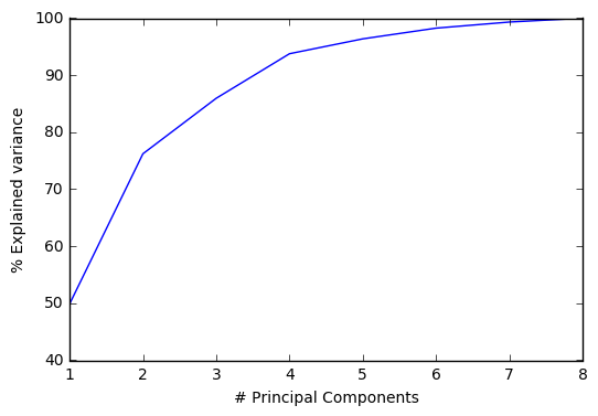
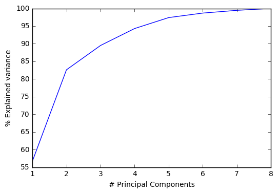
Here are the results for 2004:
2 principal components explain ~80% of the total variance in the features/predictors. So a lot of these features are correlated, as suspected from the visualizations in the previous section.

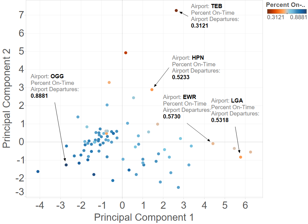
It’s also clear that number of departures is a significant ‘component’ of principal component 1 (eigenvector strongly determined by number of departures), as seen from a comparison of the 2 plots below. The other principal component is probably composed mainly of the operational delay metrics.


Here are the corresponding results for 2009:

And 2014: